Mobile Application Design / Momentum Banking
Design Strategy, Product Design / Fifth Third Bank
In late 2020, plans were made to launch a new Momentum Banking product to Fifth Third’s customers. The savings account associated with this product would allow users to create savings goals, so this feature needed to be added to Fifth Third’s mobile application. This would be the first major update to the app in several years, so the opportunity was also used to update the look and feel of the application to better align with the current state of Fifth Third’s brand.
My role on this project was the Lead Digital Product Designer, and I worked with one other product designer on the day to day design needs. My responsibilities were split between design strategy and execution; I worked closely with my manager to ensure the overall design strategy stayed on track, as well as owned several of the pieces of design implementation.
P R O C E S S
Discovery & Definition
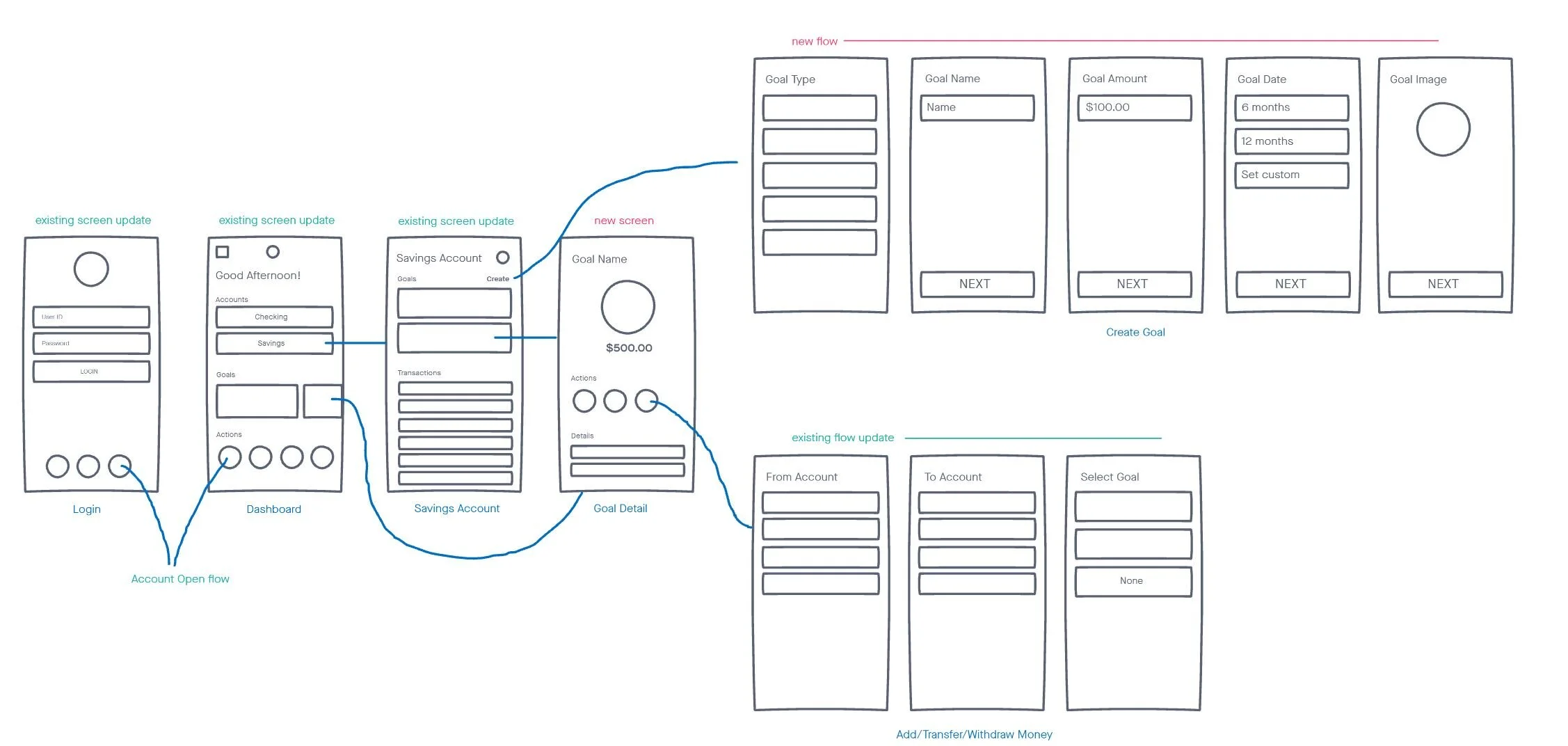
This project timeline required quick action to set a realistic scope for a six-month launch deadline. First, we mapped which screens needed updates and which were new based on the new product’s features. That guided discussions with tech and product leaders about the overall scope.
Design & Delivery
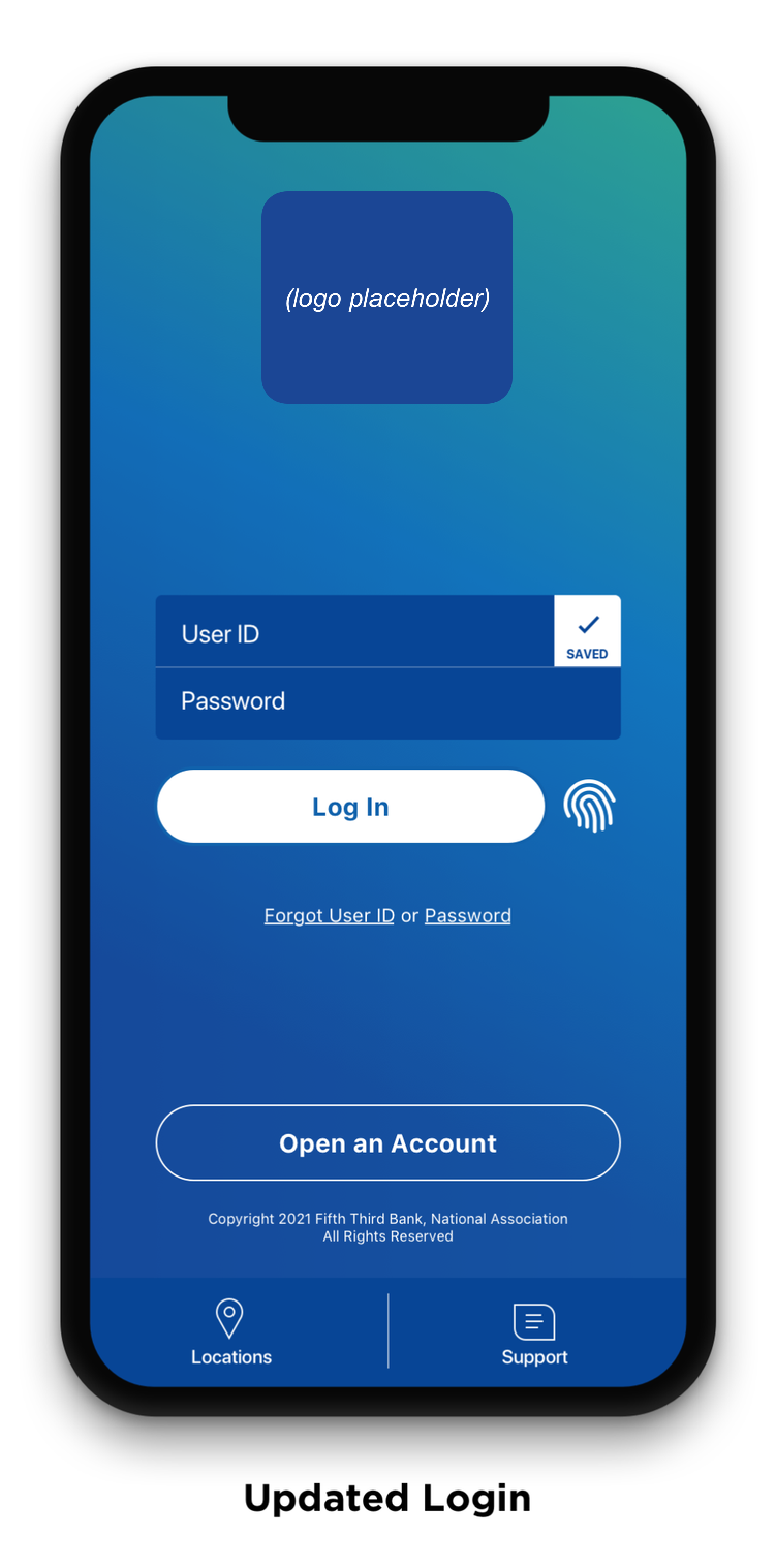
Feature #1: Login
How might we provide a more up to date branded experience to our users as soon as they download our updated mobile application?
Requirements:
Update background color, font colors, text styles, buttons, and all other UI elements to better align with brand refresh
New Account Open CTA
Add biometric capability
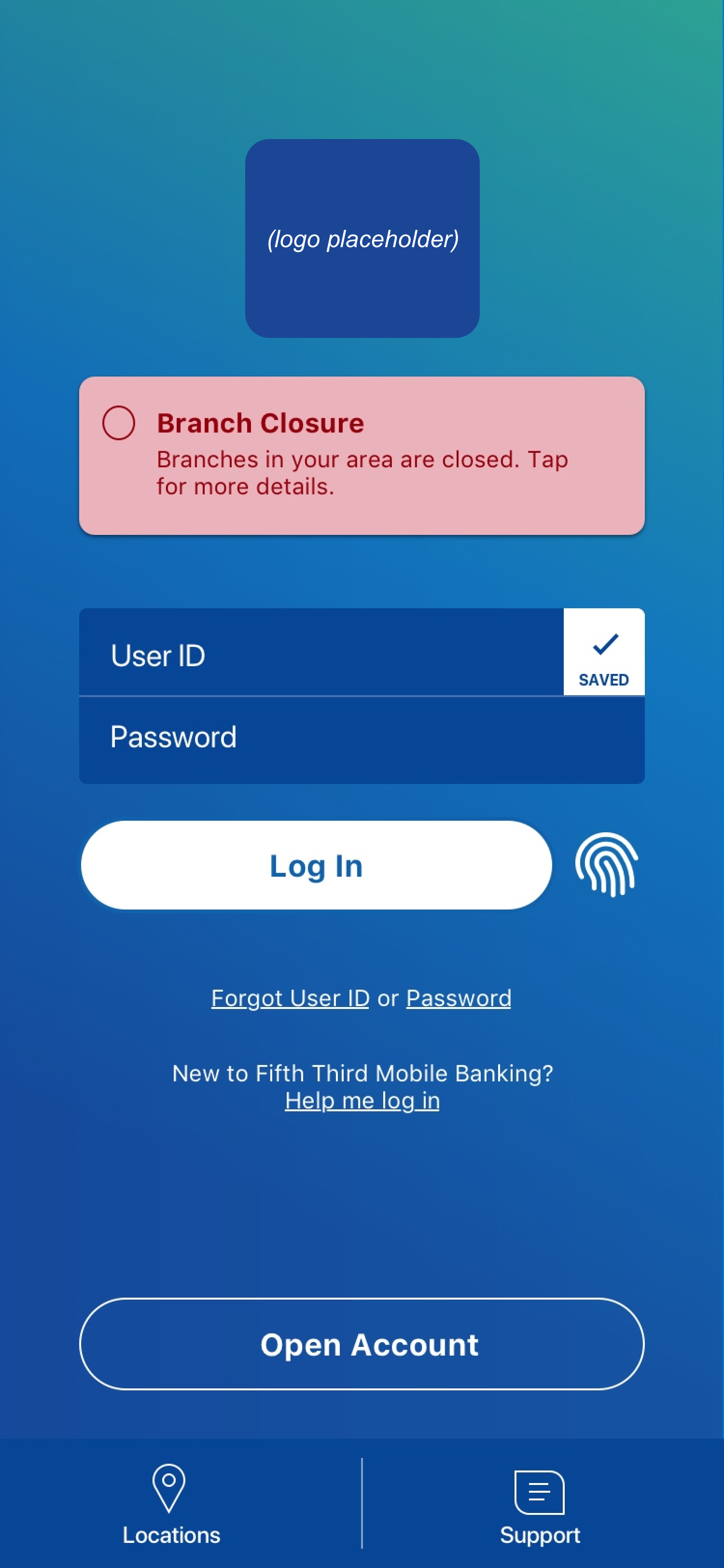
Initial iterations explored how to update the UI to be visually accessible on the gradient background provided by our branding team. Due to technical constraints, I was extremely limited in changing any hierarchy on this screen, and mostly had to rely on updating colors.
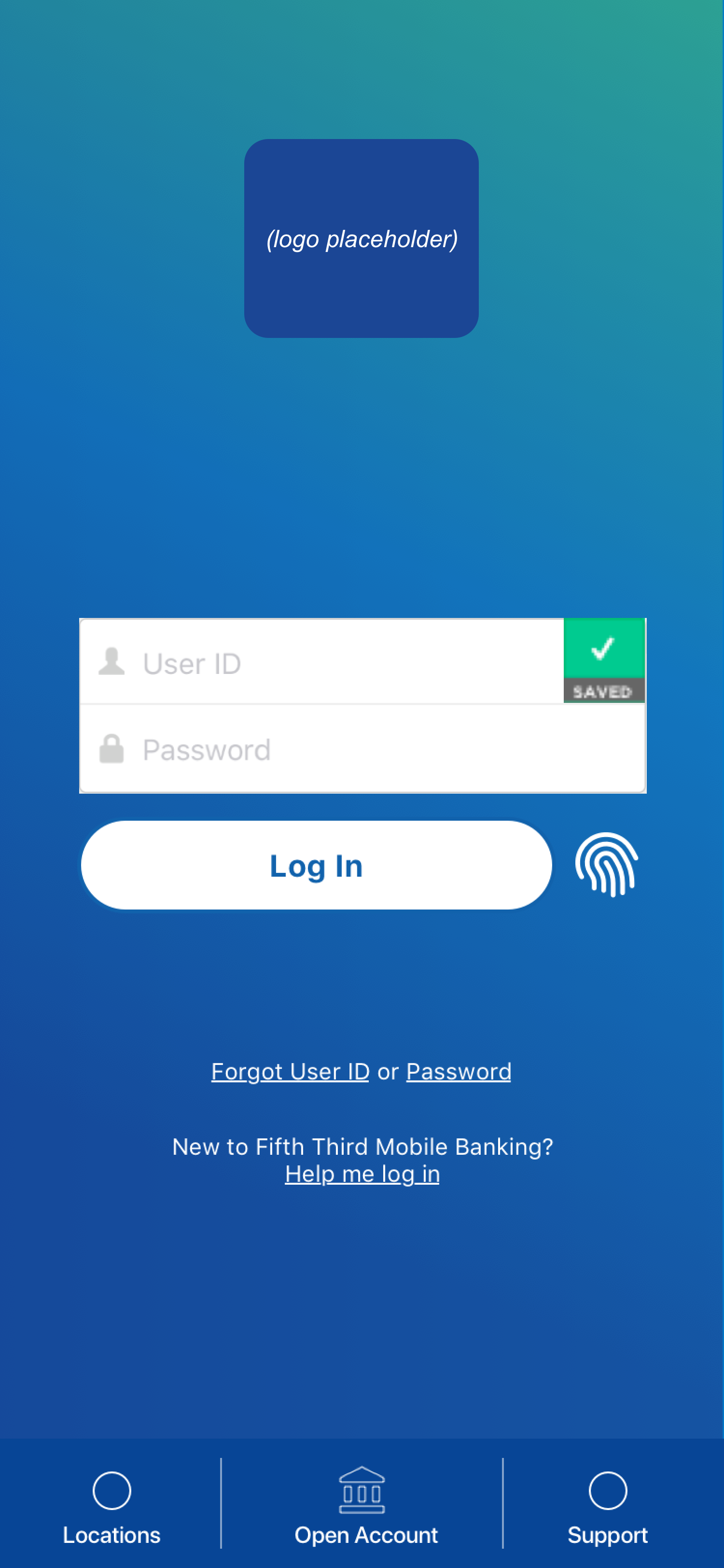
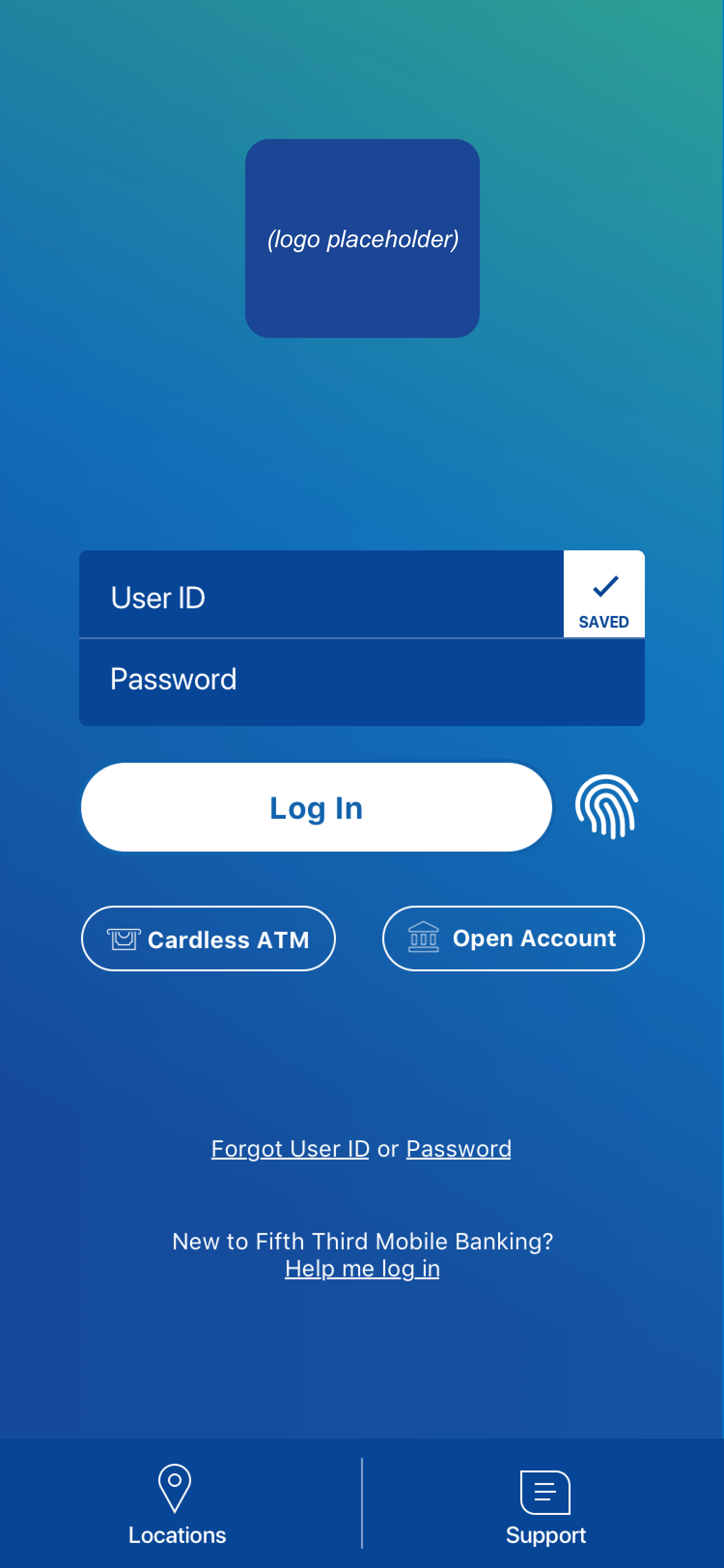
The final updated design, shown below, demonstrates the new brand look and feel with a clear Open Account CTA for new customers.
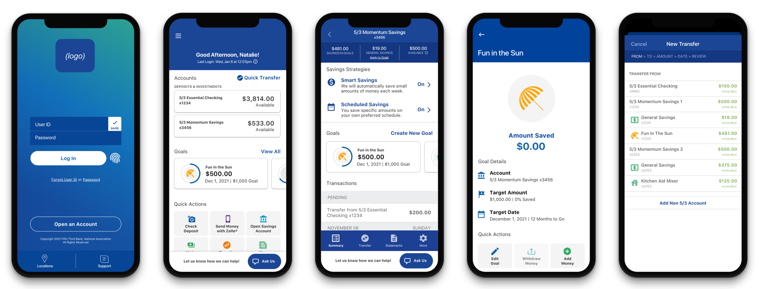
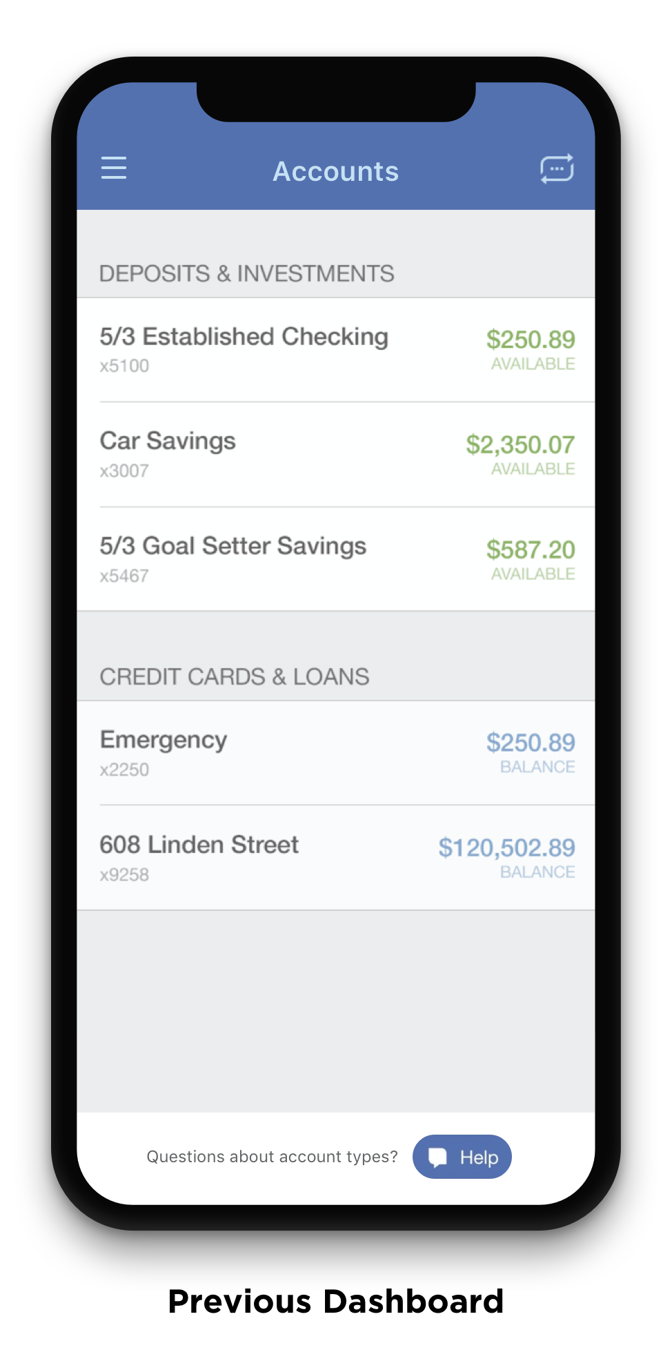
Feature #2: Dashboard
How might we streamline user entry points into the most critical features of our mobile application?
Requirements:
Updated header and logo
More personalization
Display of last login date and time
Updated alert banners for visual accessibility
Updated account card display
New dynamic Quick Actions - drive traffic to Zelle
New Goals section
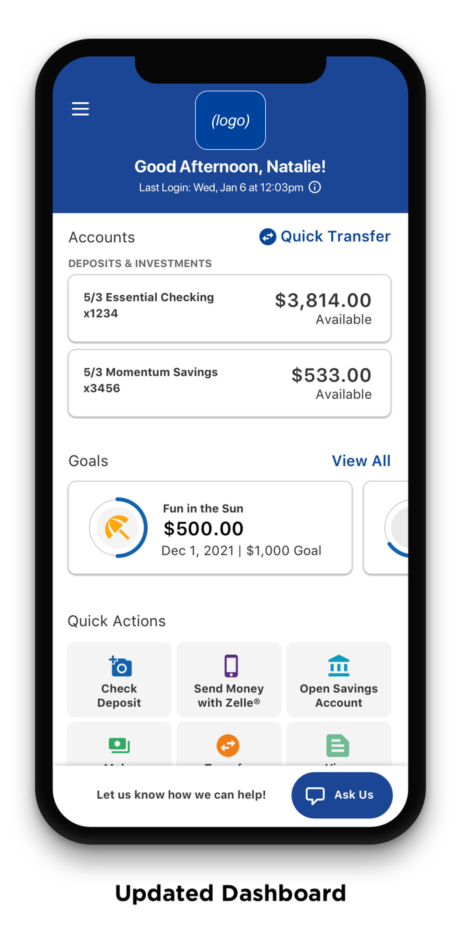
The new Dashboard was one of the largest changes to an existing screen. The previous dashboard had simply been a list of accounts, and the design team had already been exploring how to expand this dashboard to create a more personalized experience for the user. I was able to pull from that previous research in this update.
In these initial iterations, I looked at different visual stylings for Quick Actions, overall hierarchy options, and empty states for goals. I also started exploring updated colors for the alerts, since the existing alert cards did not pass any contrast accessibility checks.
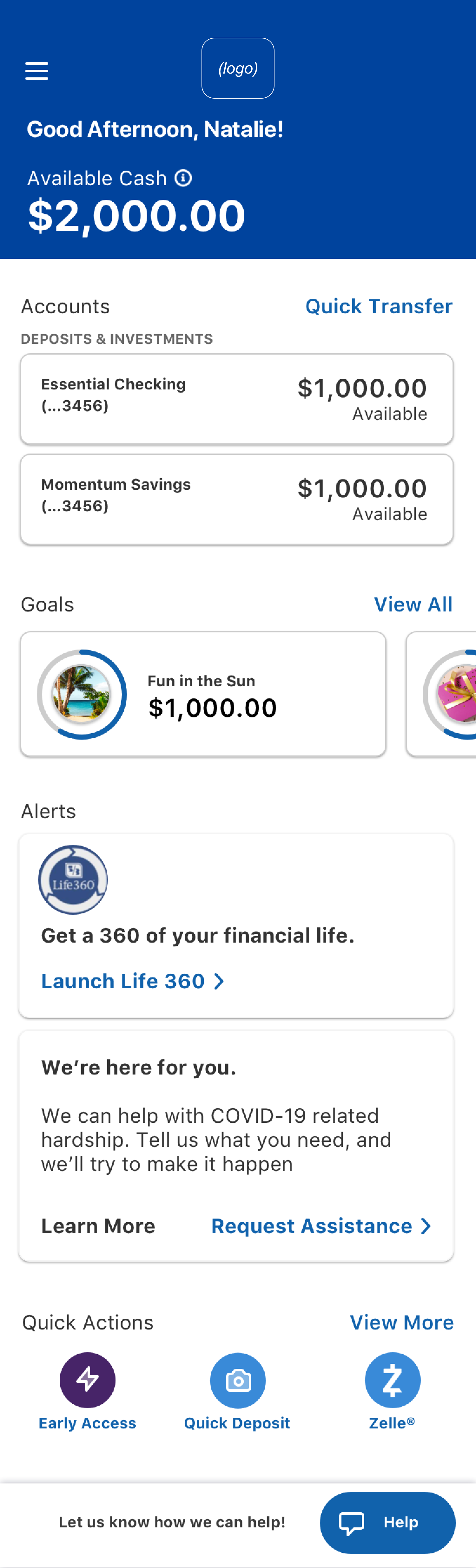
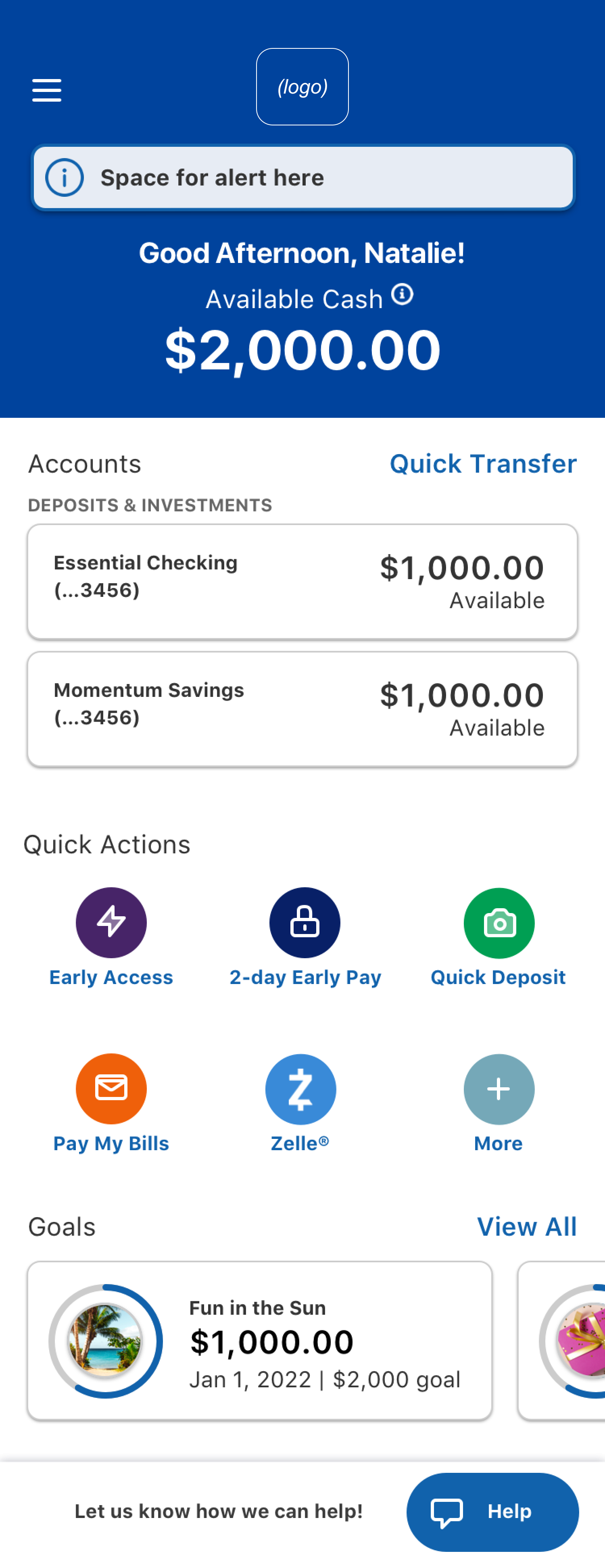
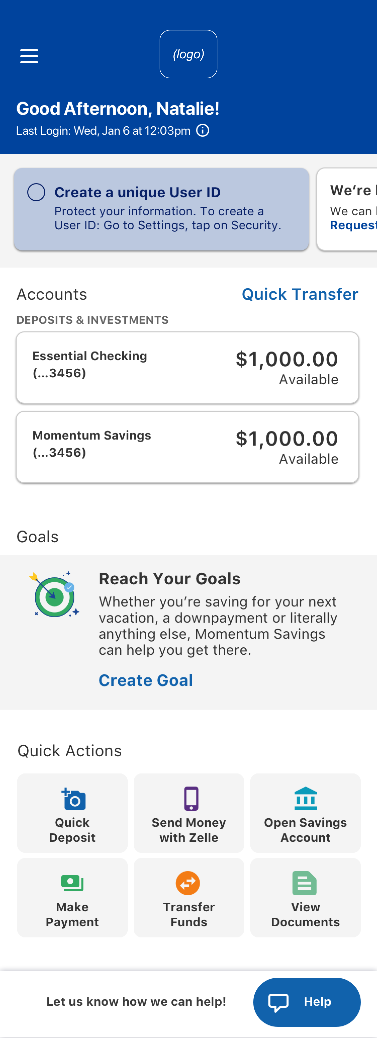
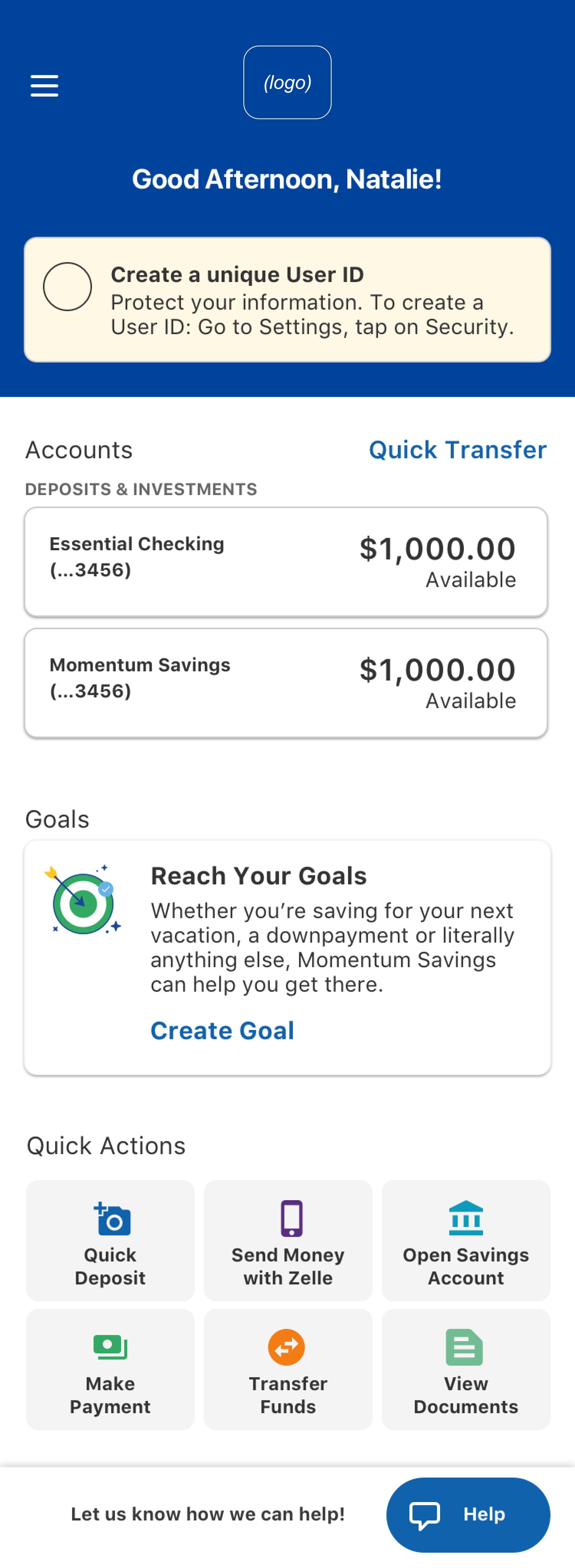
Our final update to the dashboard was a large overhaul of the existing screen. We personalized the experience by adding a greeting & last login date, provided more visual emphasis to account balances, displayed the new goals feature prominently, and surfaced critical actions in a new “Quick Actions” menu.
Feature #3: Transfer to a Savings Goal
How might we allow users to freely move money between all accounts and savings goals?
Design scope:
Transfer from an account to a goal
Transfer from a goal to a goal
Transfer from a goal to an account
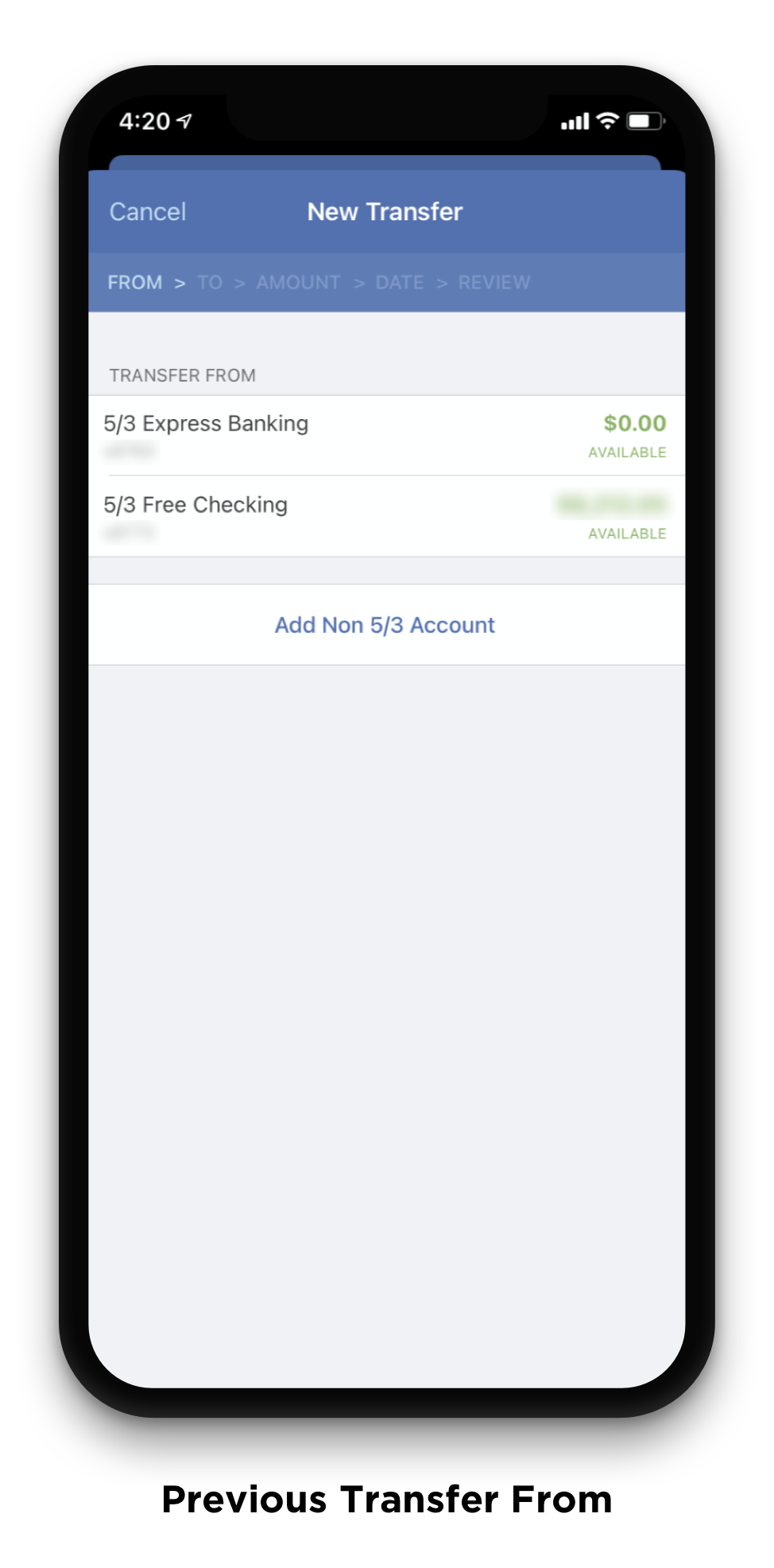
Our first step in this process was to determine how we wanted transfers to savings goals to fit into the already existing account-to-account transfer flow. I worked through several options for this user journey, and met with technical and product teams to better understand the technical limitations that we knew would impact this decision.
The direction we aligned on, which best balanced technical complexity with overall usability, would show accounts and goals together on the “Transfer to” and “Transfer from” screens, with a visual distinction to show the user which were accounts and goals.
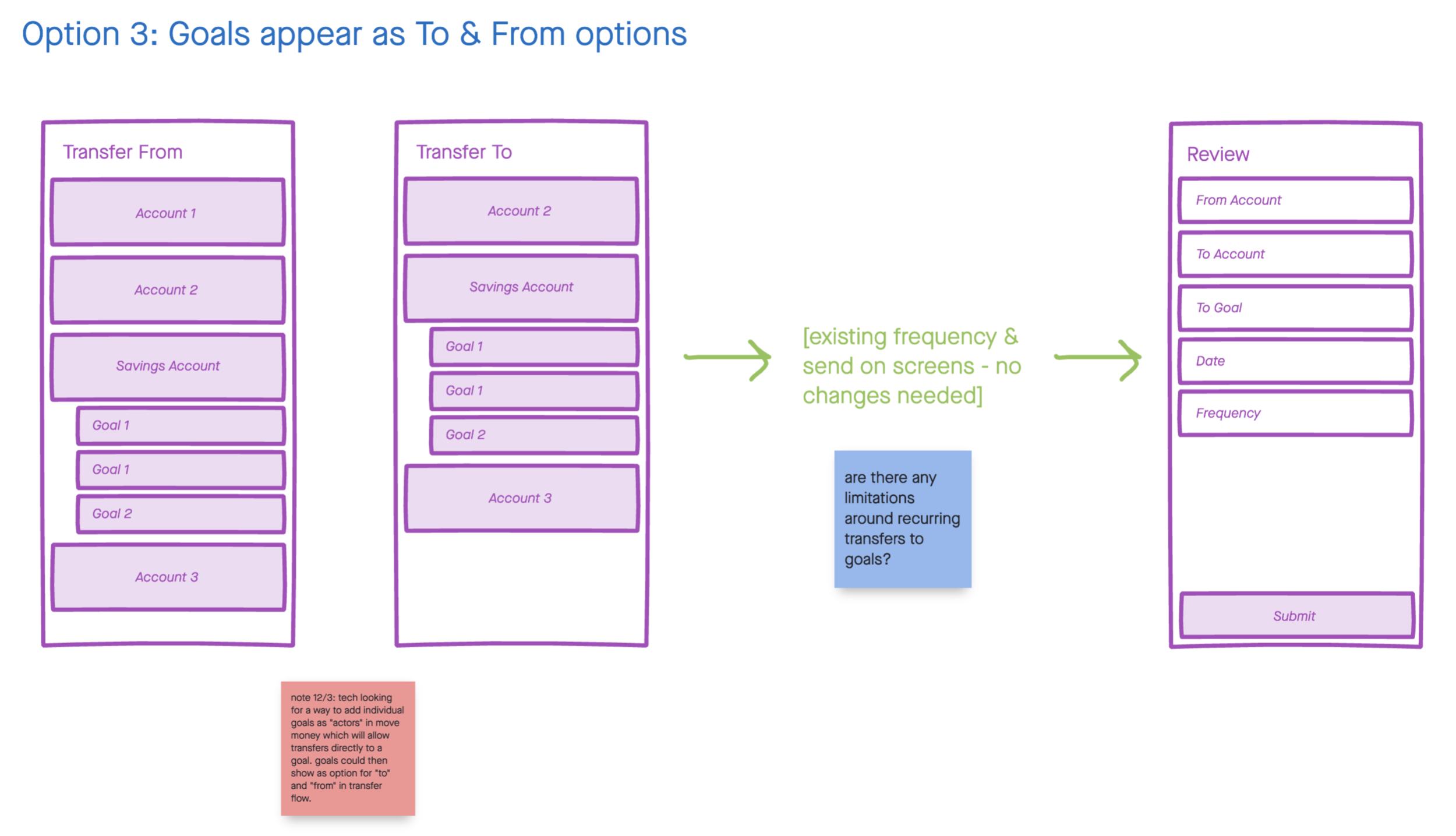
The biggest challenge we faced during this design phase was how to visually differentiate goals from accounts. Due to the technical complexity of the screen, we were unable to implement some of our initial ideas of nesting goals further under accounts. We found that a happy medium was surfacing the icon associated with the goal, which we hoped would also draw a stronger connection for our users between their different goals and the icons used to represent those goals.
The work above represents the largest design changes that I was involved in for this project, but is by no means exhaustive of the entire update. With only about 2 weeks to prepare and 3 months to deliver with the development teams, we achieved the largest Fifth Third mobile app update in recent years and added a large amount of value for our users with the new Momentum product.
Release / April 6, 2021
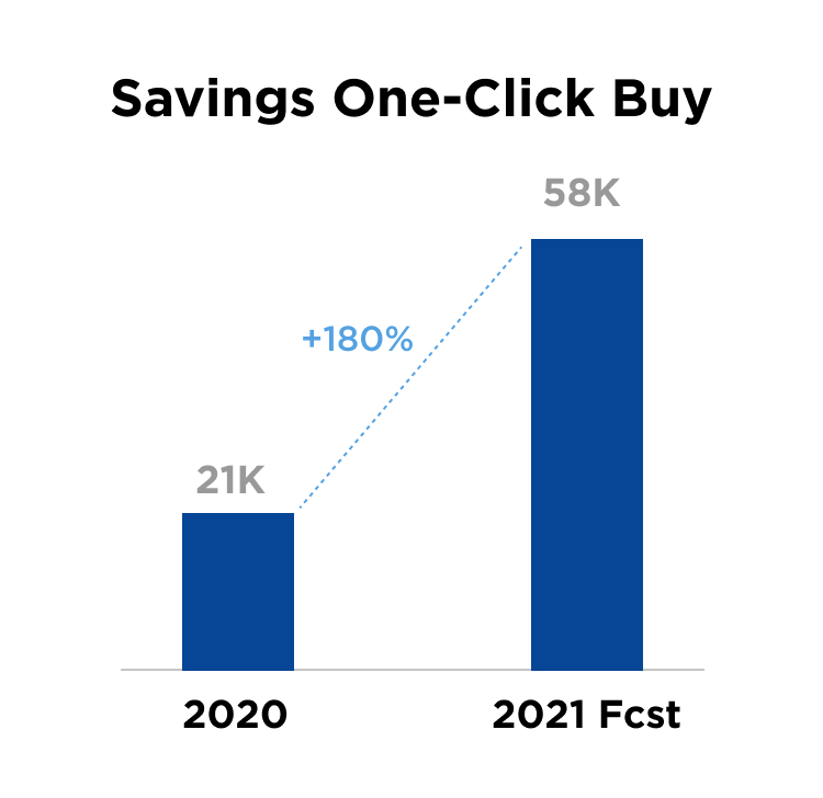
Stats as of two weeks post release.
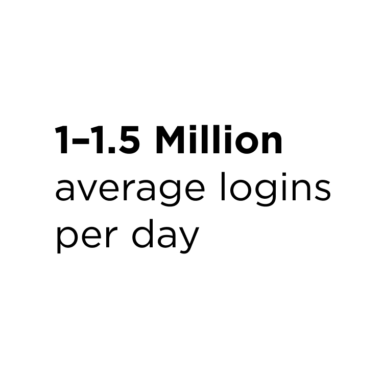
Our average logins per day remained the same, this number is just included for reference.
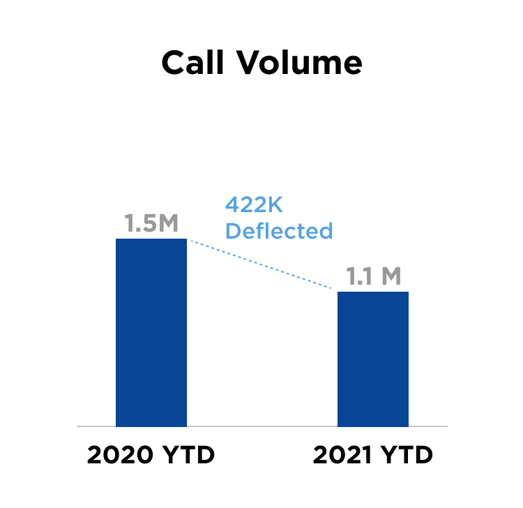
We saw 422,000 less calls to our contact center when compared with the same date in 2020.
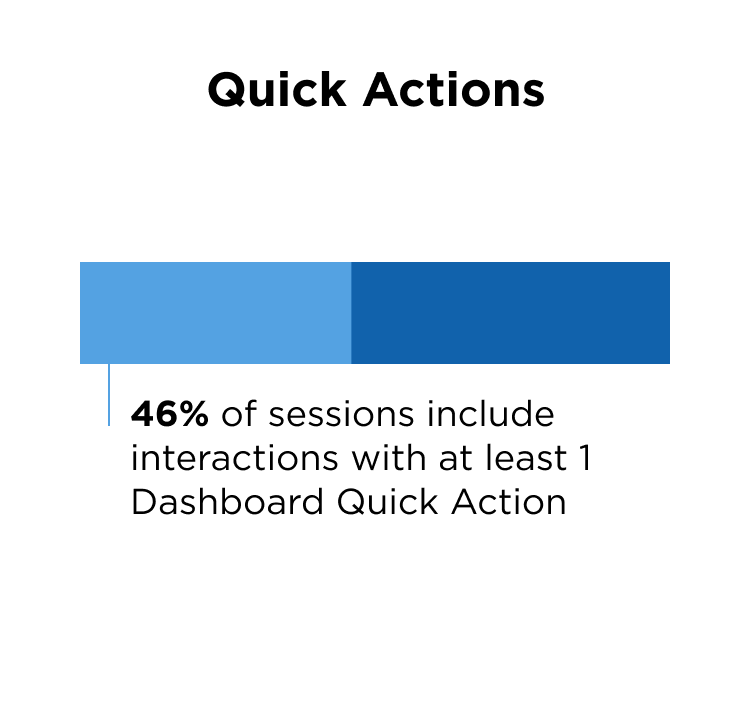
We saw almost half our users interacting with Dashboard Quick Actions.
With the addition of an Open Account CTA on the dashboard, we are forecasted to open 2x accounts compared to 2020.
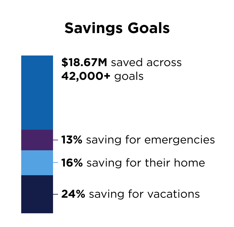
Savings goals far exceeded our expectations - with 42,000+ created in two weeks.
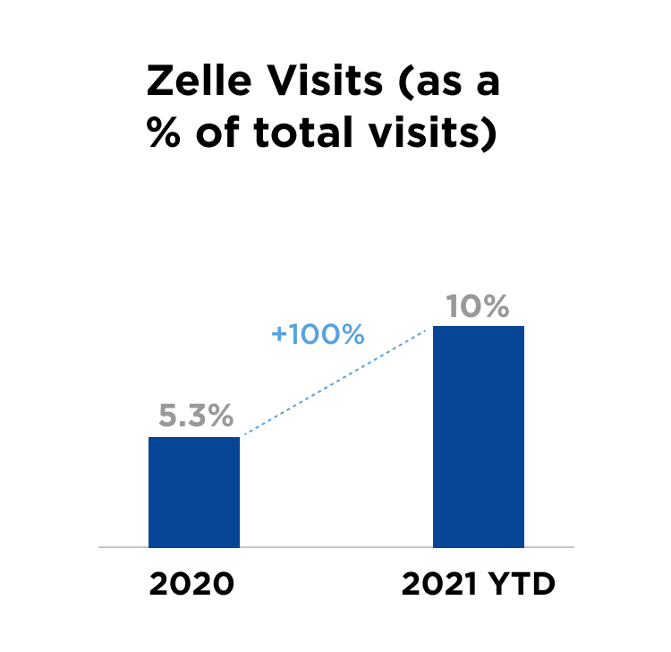
Zelle, a feature that is key to app primacy, saw a 100% increase in use when added to the Dashboard Quick Actions menu.