Website UX & Design Proposal / Holiday Inn Golden Mile Hong Kong
Research, UX, UI / Chill Creative Co.
During my internship at Chill Creative, a design agency in Hong Kong, Holiday Inn's Tsim Sha Tsui location requested help in updating their brand image in Hong Kong. They mentioned some focus areas, such as increasing bookings of the executive lounge and drawing more outside visitors to their restaurants. The client was very open to any solutions we had, and one of our solutions included a custom website to replace their corporate template website. I was responsible for conducting market research, UX explorations, and a quick design proposal.
P R O C E S S
01 / Competitive Analysis
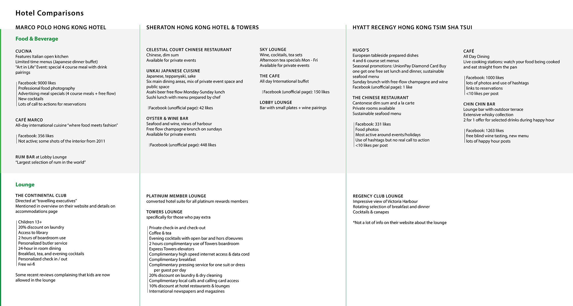
To kick off the work on the website proposal, I compiled research on how other hotels in the area around the same price point as the Holiday Inn presented their executive lounge and food & beverage options. I looked at information present on their website and social media pages that could easily be found by a non-guest, since our client want to focus on increasing bookings in these areas.
02 / Information Architecture
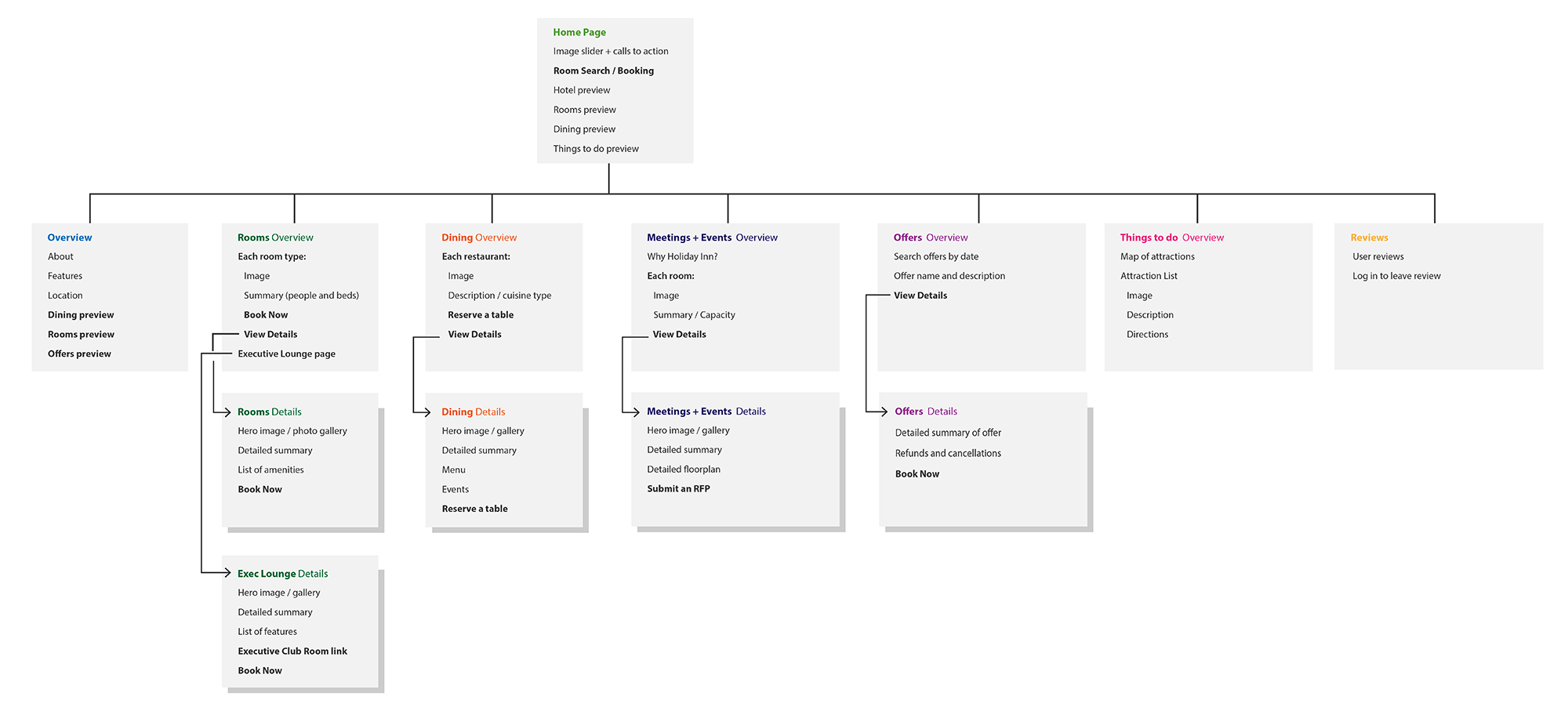
After understanding how similar hotels presented information on their sites, my main focus was on how the site could better highlight things besides just hotel rooms. Competitive analysis showed a lot more emphasis on a hotel’s restaurants, bars, meeting spaces, and things to do in the surrounding area, rather than just a straightforward focus on room booking like our client’s current site. Holiday Inn’s central location was one of the things that separated it from other hotels at this price point, so one of the new sections I introduced at this stage was a “Things to do” page that would really emphasize the hotel’s central location and proximity to common tourist destinations.
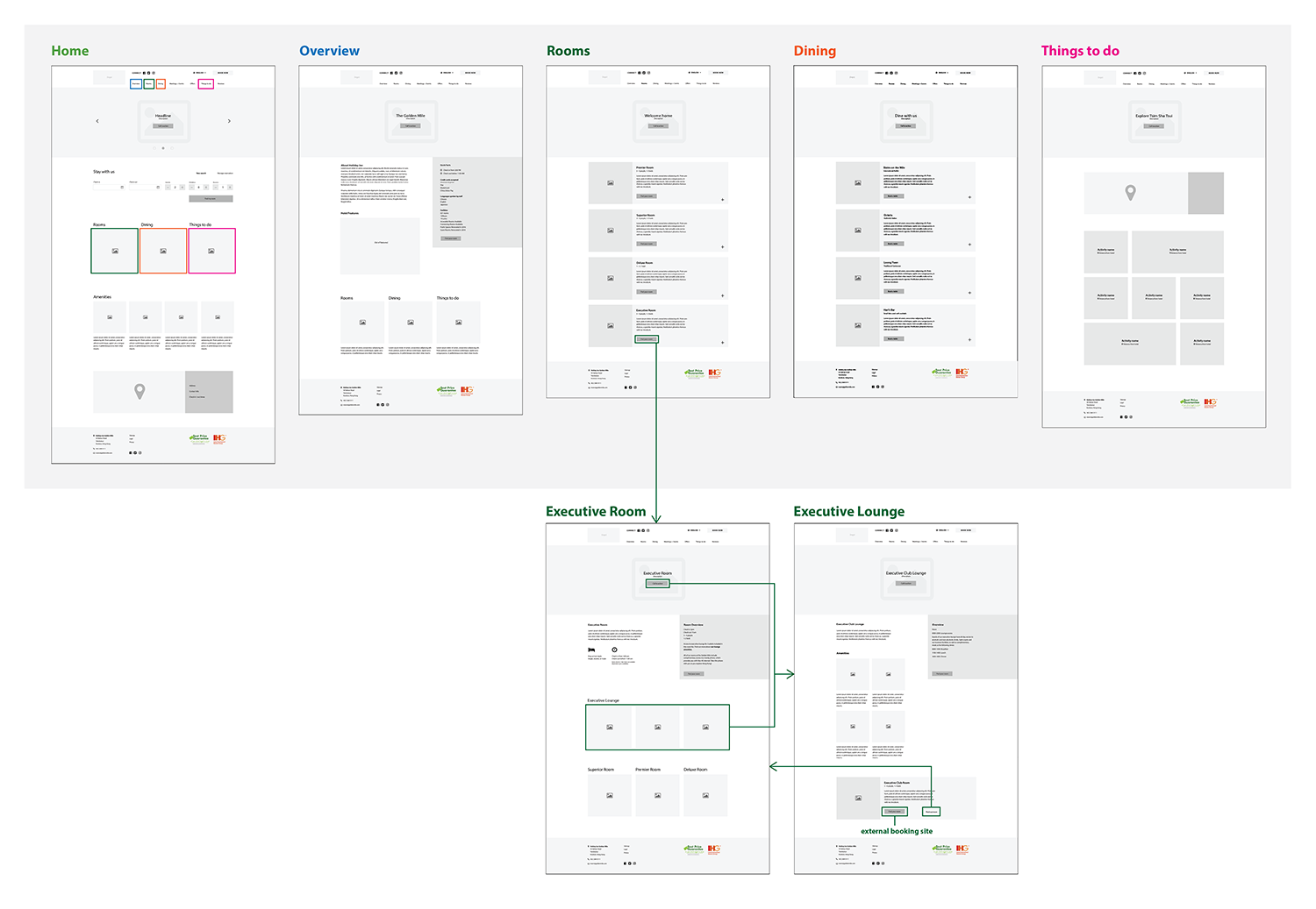
03 / Sitemap
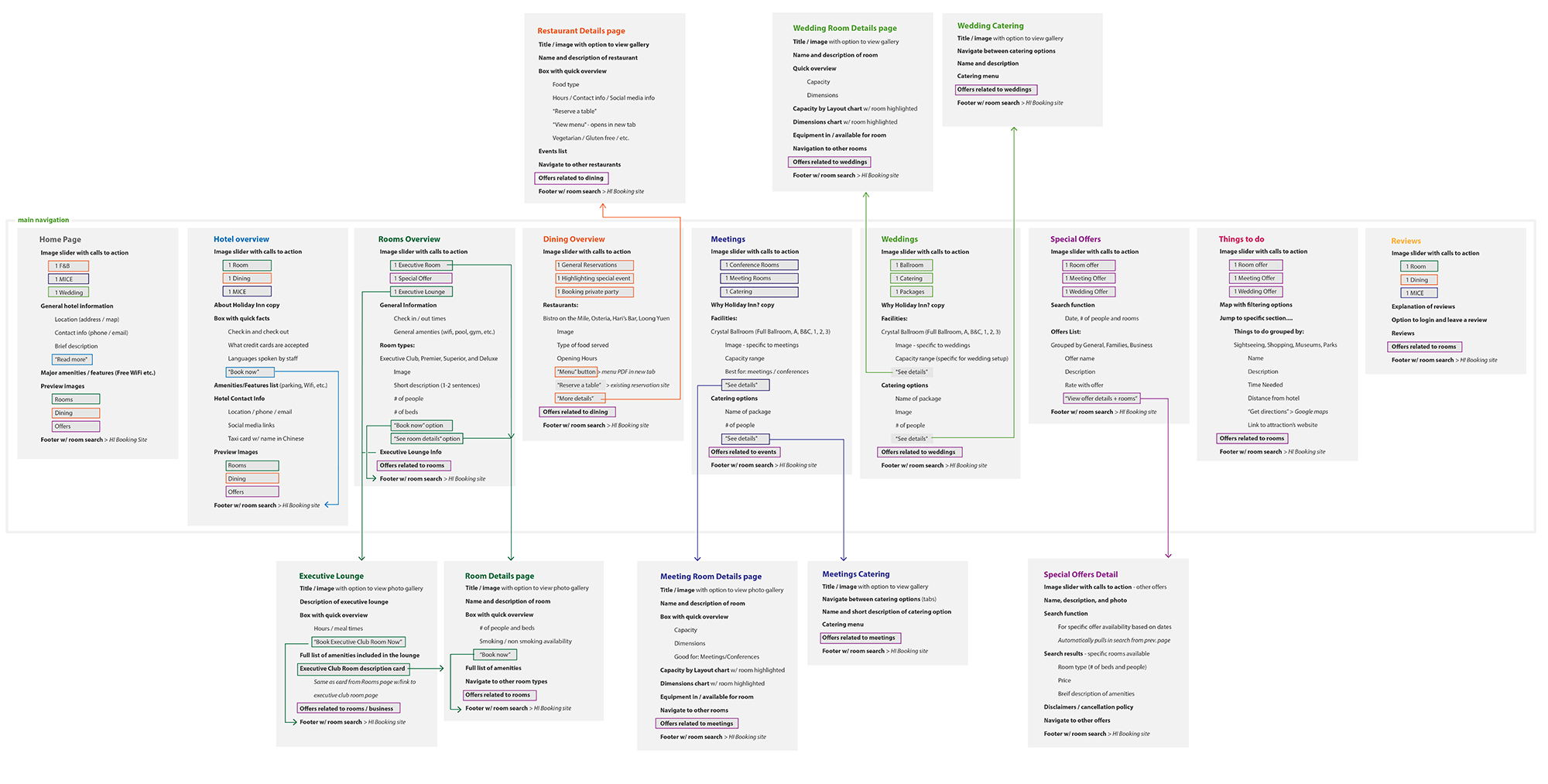
After meeting with the client to share our progress and ask additional questions, we were able to add more detail to the initial architecture diagram. We ensured each page would highlight relevant offers to encourage users to move towards booking, and demonstrated various pathways users might take as they naturally navigate through the website. This page was shared with the client to gain approval before moving on to the next step; they were extremely impressed by the level of detail and were excited to see our design concepts.
04 / Wireframe Design
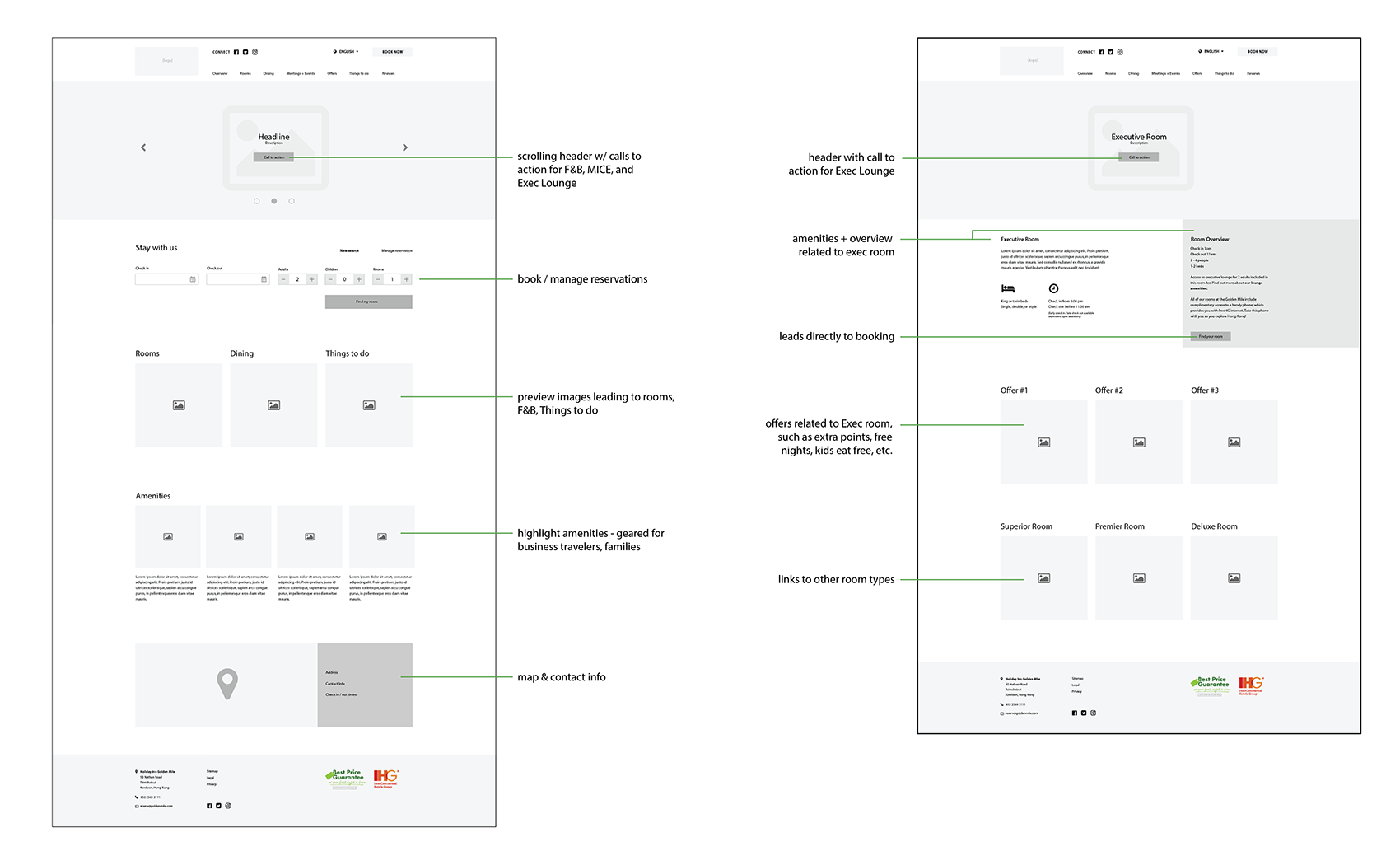
I created wireframes based on the main pages identified through the creation of the sitemap. This process helped to visually represent to the client what types of information we wanted to present on the different pages, and started to help me identify how the different sections of the site would be linked visually.
05 / Wireframe Diagram
The goal of these wireframes was to present to the client a drastically different way of organizing their website as compared to their current corporate template site. This approach shows clear navigation, highlights their social media connections in the header, and presents a way to include significantly more detailed information than their current design.
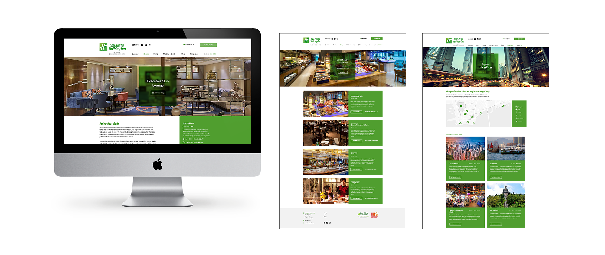
06 / Design Concept
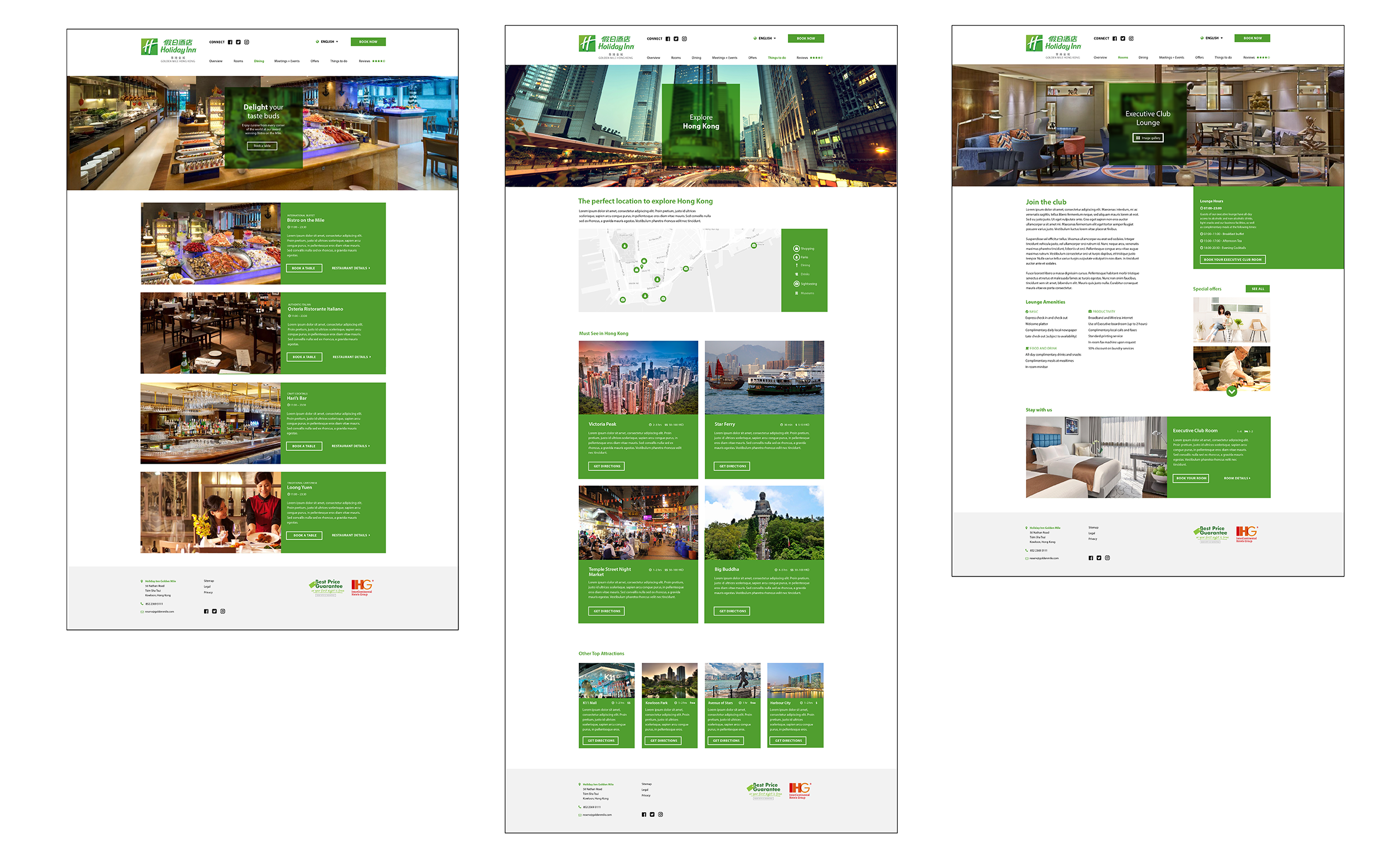
This was a quick design concept that I created in the same day that I created the wireframes and wireframe diagram. The goal of this was to just show the client an example of what the website could look like. This work was presented to the client in our final proposal, and our proposal was chosen by the client at the end of my internship.